Covid-19 Spread Worldwide

Mapping and visualizing Covid-19 spread using Python, Jupyter Notebook and Tableau.
Published on March 10, 2021 by Claudia Chajon
data analysis data visualization python
1 min READ
Covid-19 Spread by country in 2020
See the code Check out my Tableau dashboard
I placed Guatemala into the bar chart and it immediately was surpassed by the other countries, so much so that the graph kicked it out.
Using data from the COVID-19 Data Repository by the Center for Systems Science and Engineering (CSSE) at Johns Hopkins University.
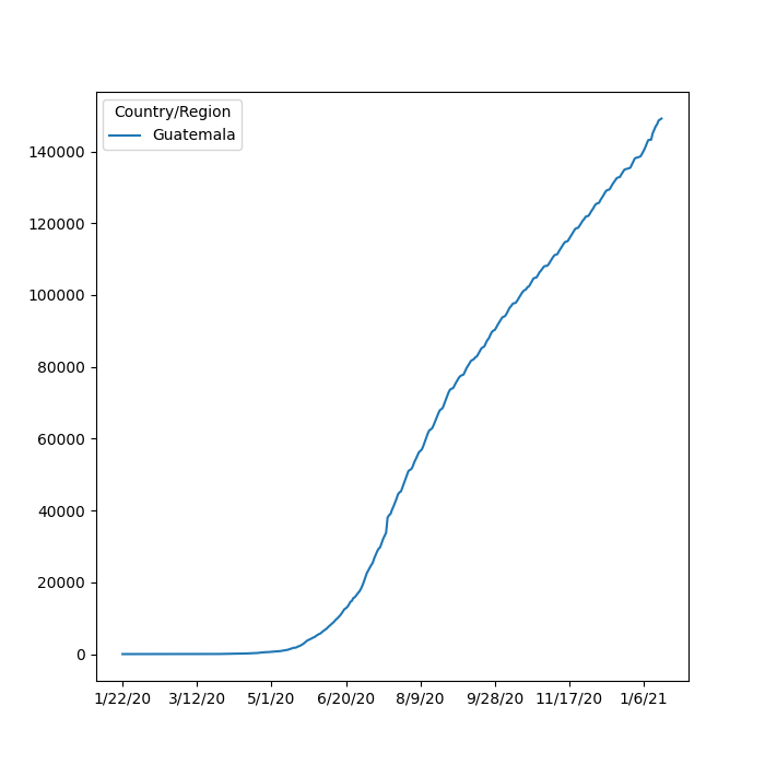
Cases of Covid-19 in Guatemala
I chose Guatemala specifically to look at because my grandparents are all from Guatemala and it typically does not get much media coverage.
Guatemala has a population of 16.6 million people. As of January 2021, Guatemala has 140k+ cases of Covid-19, which is 1/3 of the population.